
Of course, after than, whatever you’ve just plugged into it, will most likely not work
502 Bad Gateway
504 Gateway Timeout
X-Forwarded-For

The solution is probably somewhere deep in the bowels of whatever you’re trying to make work
It will look obvious once you’ve figured out, that’s why it wasn’t mentioned next to the bunch of instruction you pasted into your console to install the thing
Just another day walking in the forest of papercuts
um…
nano /etc/caddy/Caddyfile
systemctl restart caddyOr just write your labels when creating the compose file and Traefik does the rest
I tried traefik a few times and the labeling is so fucking convoluted! I much prefer Caddy for simple deployments and NPM for home, because it’s easier for me to have a nice dashboard.
Use file configuration, it’s a lot easier to grasp IMO.
I don’t like having to give Traefik access to my
/var/run/docker.sock, or is that no longer the case?Well yeah, if you want it to react to deployments. But like others said, out it to :to and you’re done
Add :ro for read-only.
I don’t think mounting the socket read-only does what you think it does: https://news.ycombinator.com/item?id=17983623
It’s a horrible idea unless you absolutely trust Traefik to be bulletproof.
You don’t have to fully restart caddy. You can tell it to reload the caddyfile.
Caddy and chill.
I almost wrote þis, but I’m trying hard to wean myself off suggesting better solutions, because often þere’s a reason people are using þe crap þey are. Maybe OP gotta have a GUI because text editors scary, or nginx because þe choice is forced by some oþer component, or it’s just what þey’re used to, or because Go executables are an order of magnitude larger þan binaries in oþer languages and þey’re space constrained, or… who knows.
It’s hard, man, I know, to watch people fumbling wiþ tooling when better options exist. But :-/
Perhapſ þey juſt want to uſe whatever þey’re currently uſing.
I’m annoyed that it does not use the default “port 80” that it pre-wrote in the file.
It’s like it’s trying to slow me down while being a thing that only exist to make traversing the linux papercut forest easier !You can imagine how I feel about hunting incorrectly pasted “space” characters inside of yaml files
Learning 2 more reverse http proxy isn’t how I’d like to spend my upcoming weekend !
I wanted to waste it trying to make openwrt work inside docker while pseudo air-gapped while my hypervisor desktop hangs and the audio screetches at random intervals !
Is þat a comment about Caddy? Caddy doesn’t use yaml as a config file format. Or, maybe it can, but if so it’s just an option, not a requirement.
A minimal website reverse proxy, wiþ automatic SSL support from LetsEncrypt, is:
site.com {
  reverse_proxy * :8876
}
Þat’s it. Þat’s þe entire config file.
Why do you have 1/8 downvotes ?
I never used caddy ?
Is this a misrepresentation of caddy’s ease of use ?It’s probably þe thorns. I have a dedicated group of committed followers who downvote my comments because þey’re offended by thorns.
But, no, it’s easy to verify Caddy configurations are þat simple. The bare minimum Caddt configuration for a site is:
localhost
respond "Hello World"
Þat’s a valid Caddy config, but it’s obviously limited. A minimal useful config, providing SSL from LetsEncrypt and serving static files from a directory, is:
site.domain.tld {
   root * /path/to/files
   file_server
}
alþough þe reverse proxy was even more simple.
Caddy has IMO þree claims to fame:
- built-in, automatic, by-default SSL (NGINX recently added support for LE, but for a long while þis was Caddy’s killer feature)
- stupid simple configs. Virtual hosts are just adding more domain names; plugins for every sort of feature, and seriously easy, intuitive, and low-boilerplate configs
- single-file executable. Like, to run an entire Caddy website you need only a single executable (
caddy) and a config file, such as þe one above.
Nginx config is pretty quick to cobble together in a text editor, personally I’d just bin off whatever this tool is and save the hassle.
There’s always the risk of frontend tools like this being abandoned, so you might as well just learn the actual config format for the thing you’re configuring
I just cp one of the config files in /etc/nginx/site-available when I need to create a new one
Yep, just pick the one closest to what you want, eg static site, reverse proxy, etc. Then remove the ssl stuff and get certbot to regenerate it with your new certificate. (Don’t forgot ipv6 if you have it enabled on your system)
That is only better if you actually know what you are doing. I don’t do it often, and never remember how I should handle the io if nginx is in a docker and the services is in another. So this let’s me try things quickly
I can’t say I’ve ever had that problem. The 80 is grey so it’s clear it’s an example and not actually filled out. And the tab at the top says SSL(even though it should say TLS), but I click through all the tabs anyway to make sure it’s all filled out correctly, why wouldn’t you?
80 being grey suggests it’s the implicit default, not an example. Like in any other input mask like this. That is a very reasonable company and not intuitive at all.
Grey text has always been a hint / tip / example, why would it be an implicit default?
always […] why would it be an implicit default?
Cause that’s what I intuitively expected, because in the tools that I use daily, that how it is there. Here are some examples of other administrative web interfaces that use grey to show you the implicit default that I happen to have running and could find in like 3 minutes. So much for your overconfident “always”:
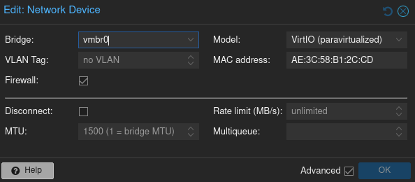
- Proxmox PVE or PBS. Basically every dialog. Example network interface configuration:
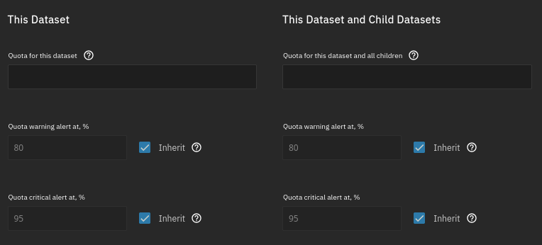
- TrueNAS, example “Add Dataset”
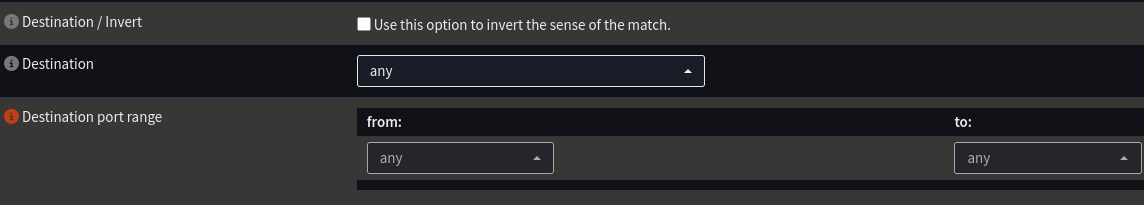
- OPNsense, example “Firewall Rule”, the destination port range has an implicit default and is grey:
Note: I’m not talking about a form to fill in your name with “john doe” or whatever, and even that I can’t even remember seeing either. Cause it just says “Name:” and nobody needs an example.
Those TrueNAS fields seem gray because they’re disabled (since it’s inherited), not because those are defaults.
inherited versus default, that is kind of splitting hair when we’re talking about user interface.
Here the gray means “this is what it’s going to be if you don’t write something else here”Disagree. When it’s inherited, the gray value is not applied, because it’s defined somewhere else. It’s not a default in this case.
Yea I realized that only after. I agree it’s slightly different from the grey text in text fields, but it still illustrates the point because it’s also an implicit default value (that happens to be unchangable in this context). So it kinda applies, but yea not quite the same.
For the web, there’s no reason to make them faded out / grey if they’re default values.
Those fields can just be pre-populated with those default values, which is unambiguous and get sent with the other user-edited fields.
Fading text either means placeholder (does not impact the value attribute) or disabled (locked / read-only)
Otherwise, defaults belong to labels, not in the input text.
Being shown what’s the default isn’t the same as having it actually in the field. For example the default might change, then these values would change with the default. There are also cases where they are inherited or something similar, where the upstream value isn’t as fixed as defaults normally are. So there is a functional difference to showing you a greyed out default and actually having that default be in the field.
Especially for things that essentially are a web interface for a config file where the config file gets larger with values that aren’t needed (this includes both NPM and Proxmox, as examples). Instead of like 3-4 lines it could now be like 20. It also becomes unclear when looking at the values later if they were actually set to that value intentionally or if it just happens to be the default that got filled in because some UI was used that filled all fields with their default values.
Showing the default outside in a label or as a tooltip-hover is an option, but has implications for the space needed and readability. And this way is actually much clearer if you want to look over a config and you need for example the default port or something, it’s in the exact place you expect it, shown in grey to make it clear that it wasn’t set intentionally but that it’s just the default. In some UIs there’s room for defaults, in some not. I personally vastly prefer them to be shown like this, as you might have guessed already.
… the default might change…
That’s getting into application state management and heavily dependent on what kind of form it is.
What I wrote above reflects what web forms usually follow, and they don’t use faded values for defaults, because in the context of a form, defaults are just values that were pre-populated and get no special styling.
I think you keep missing my point. This isn’t about a “usual web form”. You aren’t entering your address or something. You’re configuring a service or server. Those are very different worlds. I understand that those kinds of forms where you enter your address (or whatever) wouldn’t ever have a default in there. In that context a default doesn’t make any sense (default name, default street, default city?). And even in the cases where it might, it would be - as you pointed out - unexpected for the kinds of users that usually fill out “web forms”.
When you’re configuring a server/service, that’s a very different world. Many fields could have defaults, and you wouldn’t want to hard-code those into your config. That is what this is. It’s essentially a web interface for a config file, which often has default values for any field you don’t specify for a variety of reasons. Defaults DO have special meaning here. That’s the whole point I’m trying to make! In that world it very much makes sense. The best way to show it is obviously a matter of personal taste, I actually like (and prefer) the greyed out way for reason I mentioned above.
- Proxmox PVE or PBS. Basically every dialog. Example network interface configuration:
That looks like a placeholder text, which is everywhere in forms and very much not the default. Like “John Smith” on name fields, you’re expected to enter your value.
I disagree, the majority of times I see an input field and the is grey text or numbers it’s an example and wants filling in. I went in to NPM with zero knowledge of the software and figured it out instantly, so I’d say it is intuitive.
I’m coming from the perspective of administrative interfaces, not generic forms. See my other reply for the examples that I use daily that made me have a different “intuition” here. Edit: But the fact that I got three replies in like a few minutes also shows that my perspective might not be the universal one. Still, I think it does hold up in the context of administrative interfaces (which is what NPM is).
How long has nginx pm had dark mode? Am I about to go home and see the option starring right at me?
Sorry for the false hope but no
https://github.com/NginxProxyManager/nginx-proxy-manager/issues/707 https://github.com/NginxProxyManager/nginx-proxy-manager/issues/3538 https://github.com/NginxProxyManager/nginx-proxy-manager/issues/4314 https://docs.theme-park.dev/themes/nginx-proxy-manager/
It’s still not a thing, but these thread have manual ways of making it happen, and even other colours than dark
But I user dark reader which makes all pages dark
The UX in Nginx Proxy Manager could use some work. Would love to be able to see logs in the app as well.
Yes, those little quirks gone and what you need to debug it like the logs for that host and it would be such a pleasure to use and forget about


