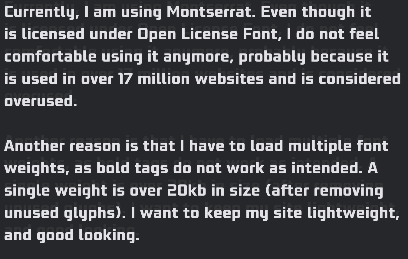
Currently, I am using Montserrat. Even though it is licensed under Open License Font, I do not feel comfortable using it anymore, probably because it is used in over 17 million websites and is considered overused.
Another reason is that I have to load multiple font weights, as bold tags do not work as intended. A single weight is over 20kb in size (after removing unused glyphs). I want to keep my site lightweight, and good looking.
Also, after looking at motherfuckingwebsite.com and perfectmotherfuckingwebsite.com, I feel sad about loading any external fonts.
I want a sans font, and I am also using -webkit-text-stroke with transparent fill to give some text outline effect.
What are your suggestions, fellow lemmings? What is your favourite font? Should I just stick with Liberation Sans?
Have only read the title. There is this cool font I found recently. It’s called comic sans and it’s really neat. Just use it with color=“red” on a black background! Looks super cool!
I don’t want to pay Microsoft. I’d rather use Comic Neue.
And looks better too. I could unironically use Comic Neue and not be ashamed of myself. Can’t say the same about Comic Sans.
tomato is the best color in css and that is fact
I’m a big fan of cosmic latte, it’s #FFF8E7
Have you considered just using the user’s browser font via
sans-serif?I did this on my website some time ago and honestly feels like it is the best way. You’re repecting the user’s wishes if they have a custom typeface specified, and the defaults on most OS’ are good these days otherwise.
Plus, you save some network requests and page size.
I used to use all sorts of custom fonts several years ago, but now I just use the system fonts instead.
Allows the site to render almost immediately without text blinking (on first load) and makes users feel as if it fits in with their OS design language
font-family: -apple-system, BlinkMacSystemFont, "Inter", "Cantarell", "Ubuntu", "Oxygen", "Segoe UI", "Helvetica Neue", "Roboto", system-ui, Arial, sans-serif;Might be helpful to ask on some of the programming comms though:
- !no_stupid_questions@programming.dev
- !programming@programming.dev (questions here should be flared [Help])
- !webdev@programming.dev
Have you tried to put a bigger emphasis on good content instead of micromanaging exotic fonts?
Just take one of the common standard fonts. Most of them are tried and tested for readbility and quality. Bonus: Nobody needs to download them from somewhere just to get your website “right”. Which means less problems and faster loading times.
I agree with this so wholeheartedly!
The internet is about information, not aesthetics. Sure, pick a nice font - no one wants Geocities back but don’t make your page call off to a dozen separate locations for crappy .js frameworks and remote fonts, please!
The only acceptable answer is wingdings.
IDK, considering the usecase, I think Webdings might be a better fit.
I like Monaco, it’s both sans-serif and monospace.
So, 20kB is not that much, honestly (even considering you probably need 4*20=80kB for regular/bold/italic/bold italic). I would just set a suitable caching policy in the server software and leave it at that. Regarding fonts being overused — unfortunately pretty much all the higher-quality ones from Google Fonts are. If you find another suitable font from Google Fonts, you may not be happy for too long.
(I used to maintain a website at work that delivered 1.5MB of CSS (600kB compressed), consisting of Bootstrap, Bootstrap extras, and then the previous two designs of the website layered on top of each other. That is sad.)
Comic Sans
JetBrainsMono

I like this font
For my website, I went with my two favourites: Ubuntu for sans-serif and Cascadia Code for monospace. I think it’s a good combination. 🙂
“Won’t bleach your fucking eyeballs at night if your browser thinks you like dark things;”
I just can’t understand why this is so rare. I often just leave white websites.
Nunito is a fun font.
Nunito is a great font
I use monospace.
system-ui
ETA: -webkit-text-stroke is meh, doesn’t look clean at all.


